Source: macworld.com
Apple's new set-top box lost a port but gained a great new way to navigate.
After more than two hours of keynote, it was finally time to kick back and watch some TV—the brand-new Apple TV, that is. Here’s what I saw in my hands-on time at Wednesday’s special event.
Interface
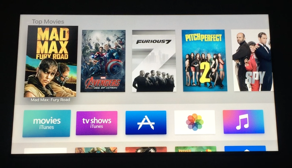
The new interface just doesn’t look new enough to me. It’s quicker to navigate since you can “swipe” through lists with the touchpad on the Siri Remote, or just ask Siri to launch the apps for you. But I’m very meh on the design.
I want to be able to control what goes on the top row, which right now is too promotional, pushing “Top Movies” and TV shows that I have zero interest in. Apple should make that work more like the proactive Spotlight screen in iOS 9, either assuming I’m here to pick up where I left off, or guessing what I might like based on my preferences.
Just lay off the hard sell a little, Apple. My three-year-old has a hard time believing that we can’t actually watch five-sixths of the movie selections shown to us on our current Apple TV’s home screen, and I’m starting to think he has a point.
UPDATE: I wasn’t as clear as I could have been—and I was totally wrong. I meant I want to customize the Top Movies row, which Apple calls the “top shelf,” not the first row of apps. In fact, according to the developer documentation, if I put my favorite tvOS apps in the top row of apps, and then select one, the top shelf will change to show me content from the selected app. All I'd have to do is replace the iTunes icons in the top row, and the top shelf would stop trying to sell me iTunes content.
Remote and Siri
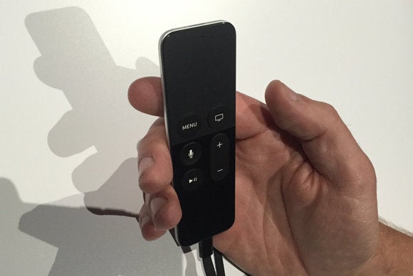
Now we’re talking—the Siri Remote makes voice search a piece of cake. You can hold down the button and ask for something to watch, whether you just want something funny, you’re looking for a movie for your kid, you want to watch the New Girl episode Prince guest-starred on (which you should, it’s hilarious), or you’re just in the mood to gaze at Brad Pitt or Ryan Gosling (I feel you).
In my demo time, voice searches were quick and accurate, just like on the Amazon Fire TV. Being able to search within results is huge. You can ask for kids movies, for example, and then specify just the animated ones, or just the ones with Robin Williams. Much handier than having to start the search over just because you want to tweak it a little.
The Siri Remote is comfortable to hold, and should make a passable game controller thanks to its accelerometer and gyroscope, but the fact that Apple wants to charge $13 for a wrist strap to keep you from dropping it is obscene. (Then again, replacing the remote will run you $79, so maybe we should consider using Stickum like a bunch of NFL wide receivers in the 1970s.)
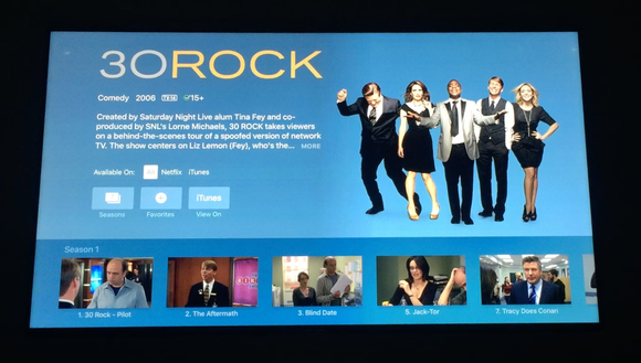
Searching brings up results for multiple services at the same time. Ask for New Girl, and it’ll show you what’s on iTunes as well as Netflix and Hulu. (HBO is also supported, but they don’t have New Girl, of course.) Apple says it’ll add more services over time, but those are a great start.
Siri can even let you navigate once you’re watching something. You can ask her to skip forward a minute—Apple wouldn’t tell me if that works to skip commercials in Hulu, but I doubt it. You can even ask, “What did she say?” if you missed a line, and the playback will jump back 10 seconds and temporarily bump the volume so you can catch it on the replay. That’s all very cool.
Apps
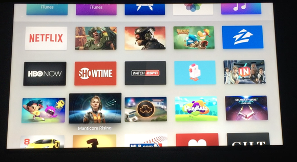
My demo included a peek at some games, like Galaxy on Fire 3: Manticore Rising. They looked great, like console games, but I’m not a console gamer and I don’t get excited about stuff like background detail and bloom lighting. I saw a demo of Rayman Adventures played with just the Siri Remote (held sideways), as well as a stripped-down shooter called Fantastic Plastic that automatically shoots for you as you aim.
MFI game controllers are supported too, so you can play multiplayer with up to 4 people, and Game Center lets you play against people over the Internet. We weren’t blown away by the Fire TV’s similar approach to gaming, but Apple has greater developer support, so maybe it can succeed where the Fire TV fizzled.
Neither the Gilt app nor the Zillow app convinced me that shopping from your TV is going to Be A Thing, but that’s just a personal preference. At least with the new Apple TV’s App Store approach, you won’t see apps you don’t want. The new MLB app looks cool, taking advantage of your TV’s big screen to show you multiple live games at once.
Ports
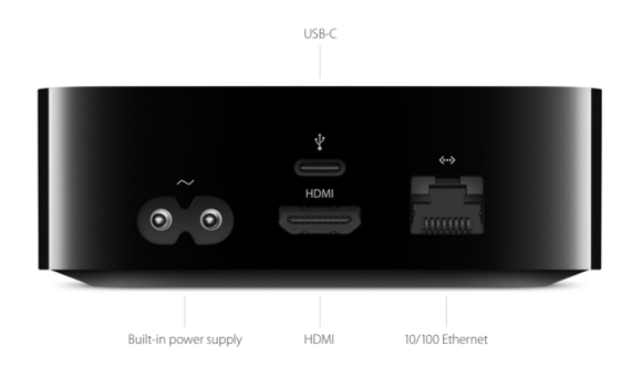
The new Apple TV looks just like the old Apple TV (which is still for sale for $69), only it’s about half an inch taller. But even with more surface area to work with, Apple ditched the optical audio-out port on the old version. Now the only way you can get sound out of your Apple TV is with HDMI.
And that really stinks. My current Apple TV—used daily—is connected to my TV with HDMI, as well as my stereo receiver with an optical audio cable. That way, if I’m just watching TV that will sound good enough on my TV’s speakers, I can leave the stereo off. But if I am watching Top Gun or something, I can mute the TV, flip on the stereo, and enjoy Tom Cruise’s antics in surround sound. I like having the option. I also enjoy sending music from my iPhone, iPad, and Mac to my stereo via AirPlay on the Apple TV, and my television can stay off.
Sure, newer receivers have HDMI or even AirPlay built in, or I could use an AirPort Express to AirPlay music to the stereo, but it bums me out that Apple didn’t think it necessary to let users select different audio outputs for different use cases.
Still, the new Siri Remote and the multi-channel search are huge steps in the right direction, and I’m looking forward to thoroughly testing the new Apple TV when it ships in October.
No comments:
Post a Comment